ThinkCompass logo design case study:
Phase 1: Gathering Information
Gathering information about the ThinkCOMPASS vision, mission and philosophy was the initial attempt in my design process. In order to create a logo that is strikingly different from other logos in the same market niche, in terms of the logo’s shape, colour, font, and image, I researched about other competitors’ visual Identity.
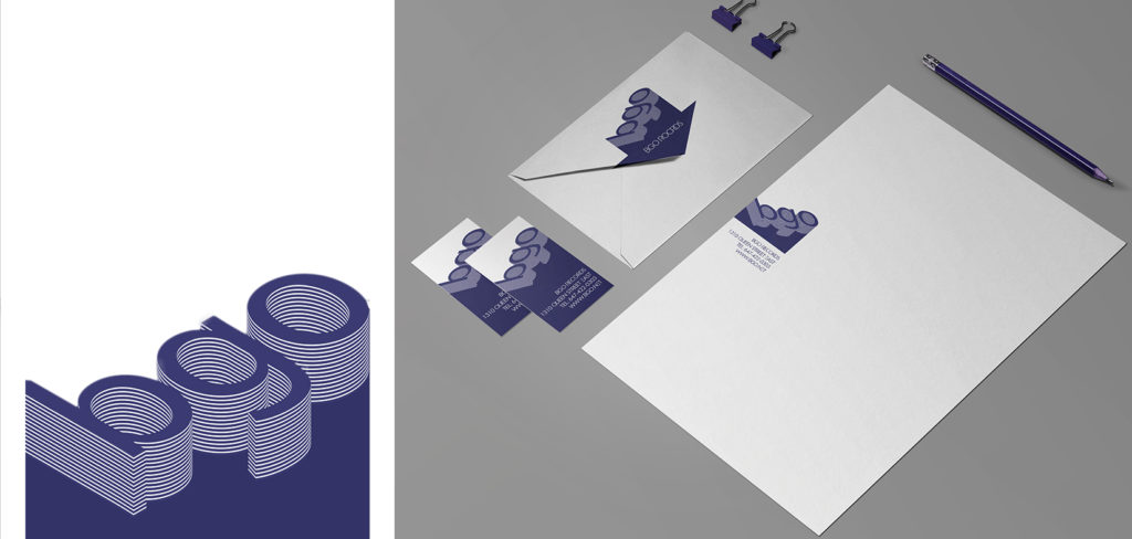
Phase 2: Design Process
My design process with aim of making the ThinkCOMPASS’ logo immediately recognizable, memorable, simple, appropriate, resizable and timeless, has been started. I created several sketches and mockups. Then brainstorming to choose those that are better align with my design’s goal.
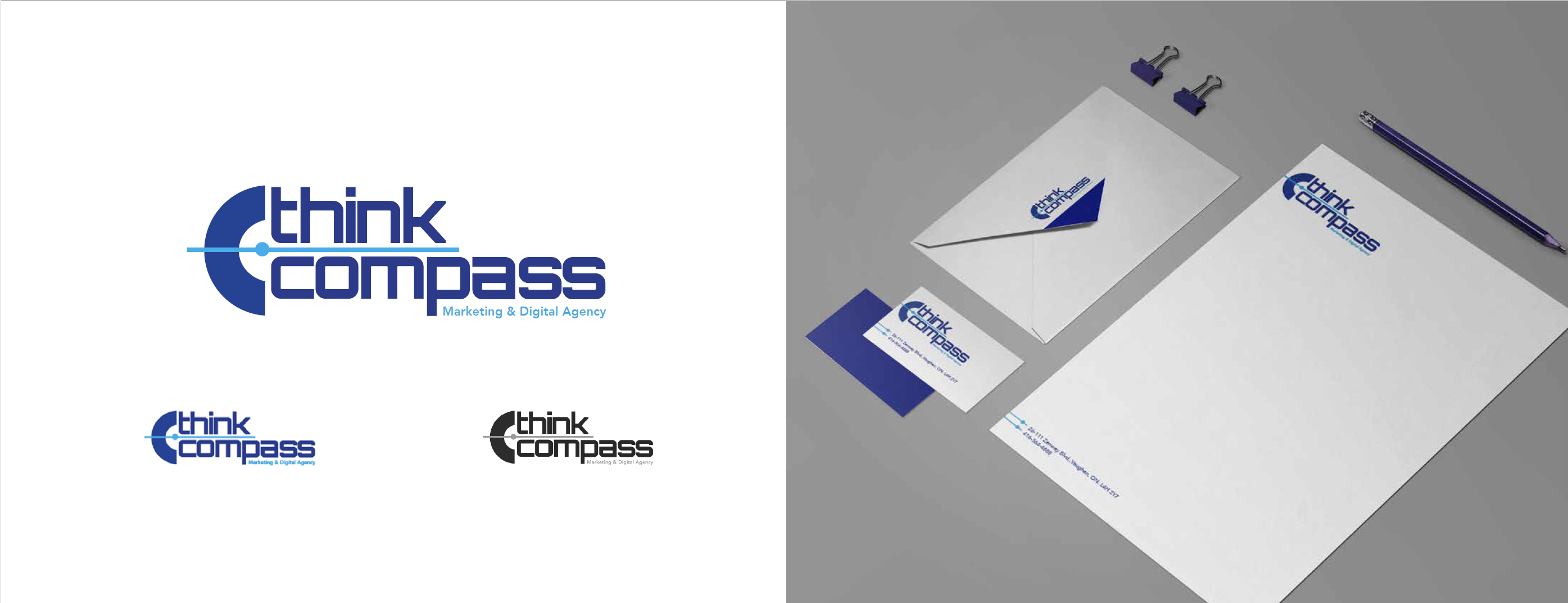
Logo Design Rational:
Symbolism and Relationship:
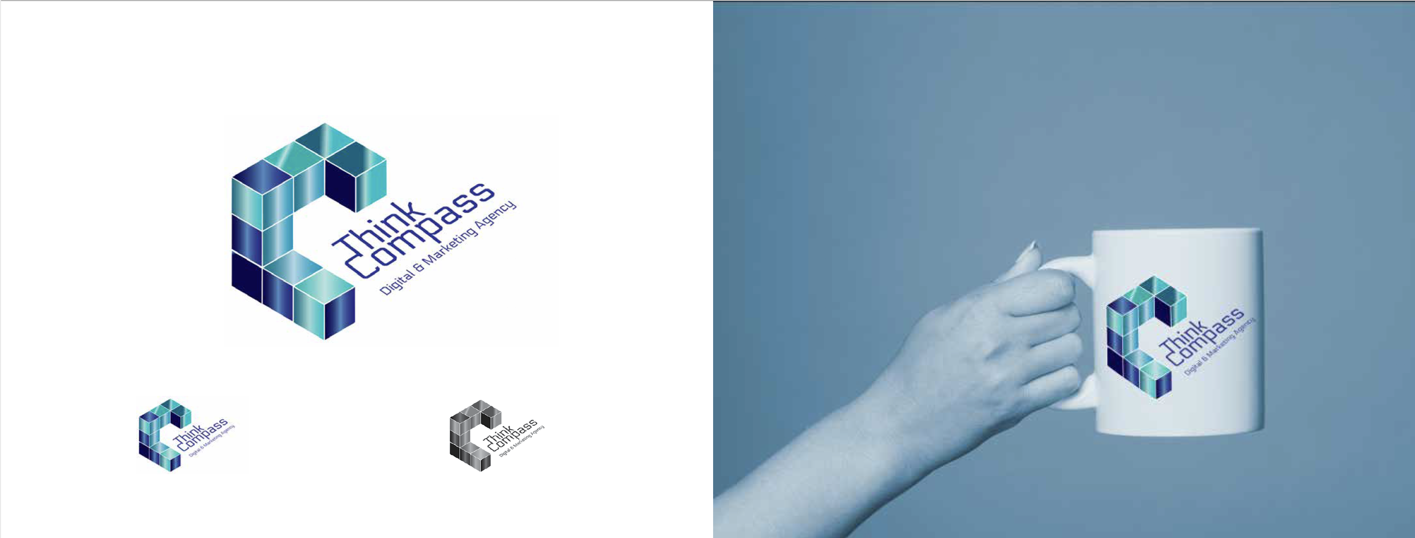
The chosen icons are based on the meaning of the 2 words: THINK and COMPASS. It symbolizes digitalization, standards, clarity, precision, accuracy, relevance, depth, logic, that are all foundation of the critical thinking. These concepts are closely related to the Think COMPASS’ personality, goals, vision and values.
Style:
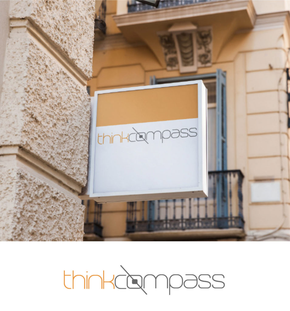
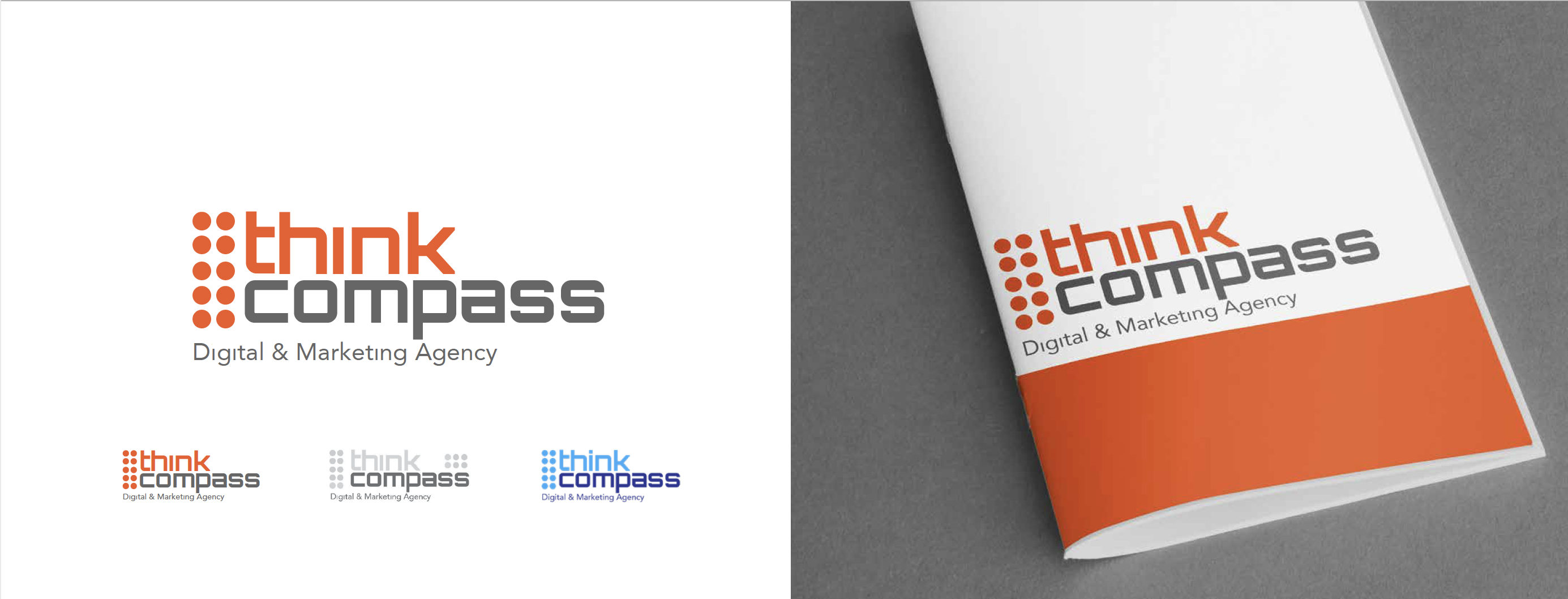
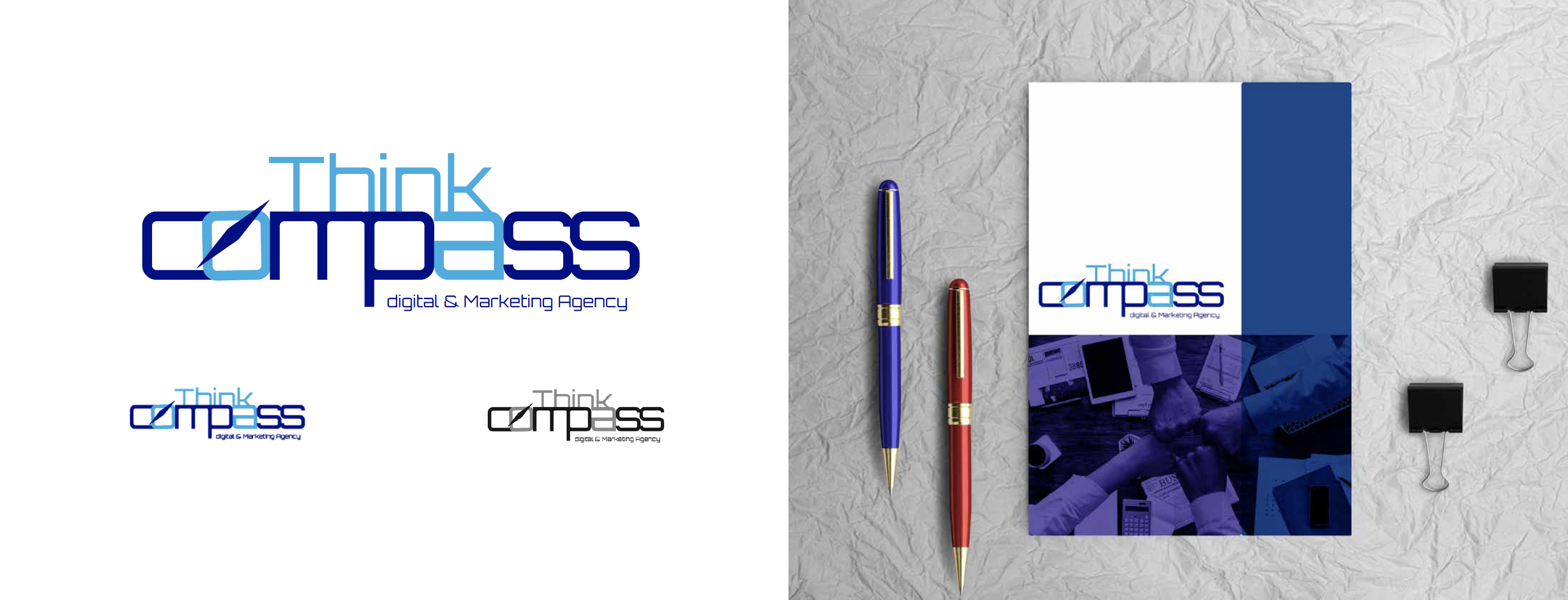
The chosen styles are aligned well with the latest 2018 logo designs’ trends. To exemplify, narrow and thin typography, dotted (pop art) pattern, cubical 3D shapes, gradient colours.
Colour:
ThinkCOMPASS current colour palette has been used for some of the designs, however, a warm colour like yellow or light orange can make the logo more fresh and vibrant and has strongly recommended. Also, based on the colour theory these colours can symbolizing critical thinking, logic, as well as transferring a big sense of friendship and familiarity with their audiences. Moreover for quality assurance all the logos have been checked on grayscale mode as well.
Scalable and resizable:
All the logos are fully scalable and can be used on different mediums easily in various sizes without quality lost.